Orbis Caffe Training Materials
Project Overview
The Methods Bar Cards for Orbis Caffe are a set of cards that detail the ingredients and instructions for making alcoholic drinks. These cards are intended for use as a training material for new employees and were developed to help current employees familiarize themselves with a new branch of the cafe.
Project duration: July 2022 - July 2023
Role: UX Designer & UX Researcher
The Problem: Employees don’t know how to make new menu items.
The Goal: Design a reference material that is discreet and can be accessed quickly.
User Research
I conducted interviews with current employees to understand the users I’m designing for and their needs.
This user group confirmed initial assumptions about frustration in the learning curve, however research shows additional user problems such as not wanting to appear unknowledgeable to customers during a shift.
User Pain Points
Training
New employees want a document that will help them learn; older employees want a document that can refresh their memory if needed.
Organization
Users want a quick way to reference everything they need to know about a drink recipe.
Discretion
Users want a discreet way to use the recipe document that doesn’t take away from the upscale bar atmosphere.
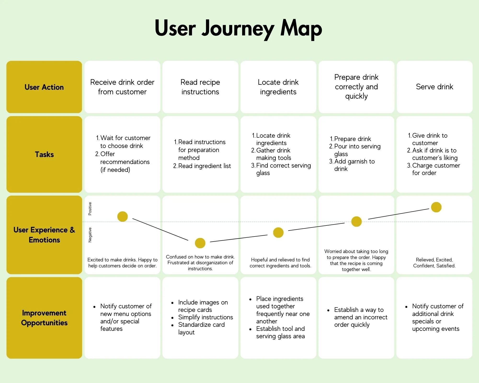
User Journey
Creating a user journey map highlighted the necessary elements to include in my design.
The Design Process
Initial drafts included the basic recipe information and color coded drink titles. Each card was drafted in a 2 inch by 6 inch format as per the bar owner’s request.
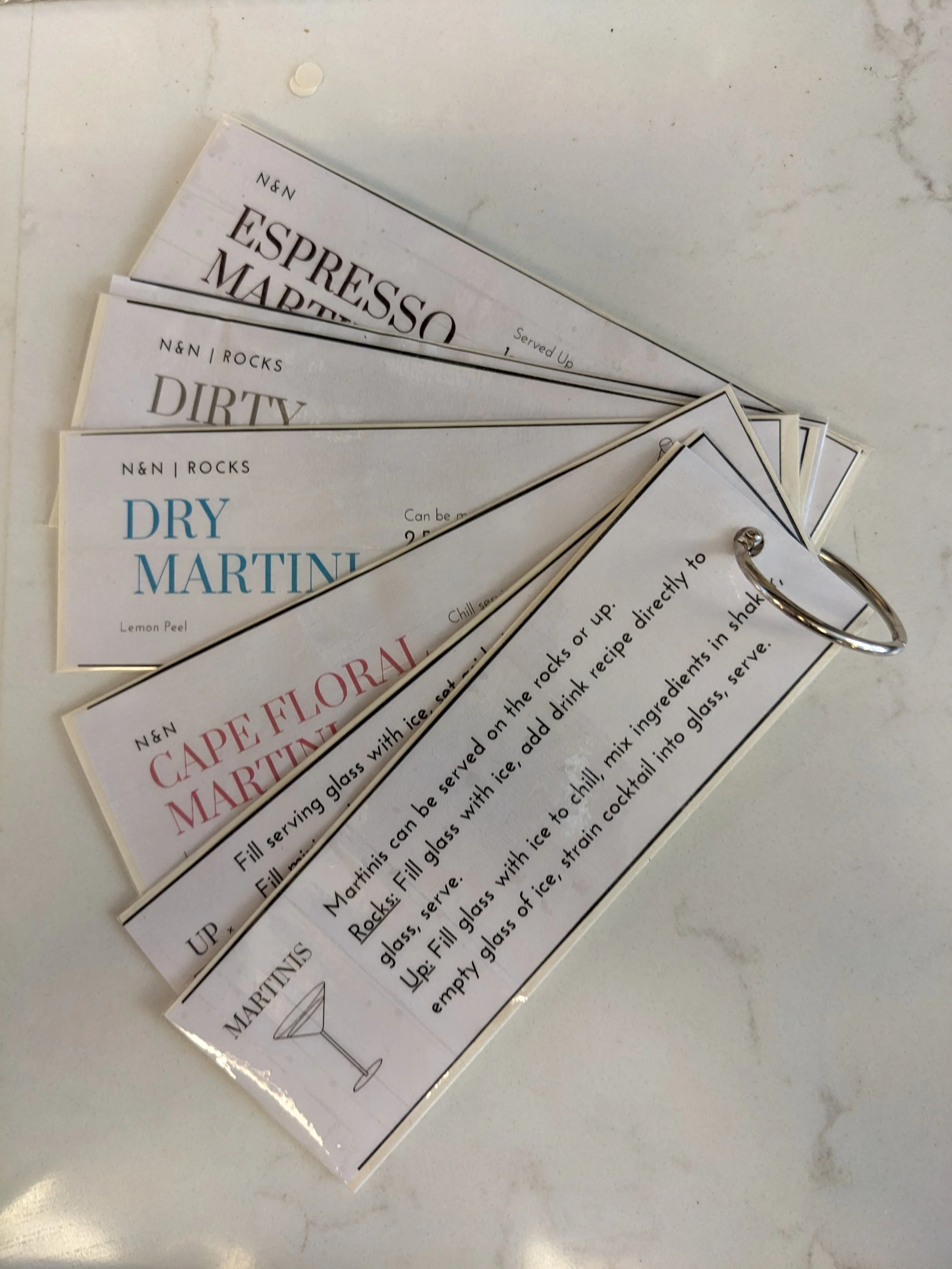
The first round of cards were printed on thick paper and laminated to protect from any liquid that might spill during a busy shift.
Color coded titles reference the color of the finished drink.
Usability testing revealed that the employees were confused on how to use the bar cards to the fullest capability.
Designs were revised to include a ‘how-to’ card, and broken down into types of drinks.
The How-To card tells employees how to read each recipe. All cards contain the same layout and basic information.
Final designs sorted cards into categories, allowing for employees to more quickly find the appropriate card. Heading cards for each category highlight the type of drink, the method used for making that drink, and a corresponding image for quick reference.
Incorporating Usability Study Feedback
Category Heading Card
Category Recipe Card
Corresponding image that references recipe method.
Short reminder text of specific instructions.
Category Heading Card
Category Recipe Card
Corresponding image that references recipe method.
Short reminder text of specific instructions.
In Conclusion
The Bar Cards are a discreet and simple way to keep employees up to date on current drink recipes.
Iterating on designs as the business grows alongside user feedback will be a necessary feature of the cards.
Going Forward
Implement new drink methods and recipes into design format.
Conduct additional usability studies to determine any new areas of need.
Thank you for viewing the Orbis Bar Cards Case Study!
More of my designs can be viewed on the ‘Recent Projects’ page.


