Noshie Mobile App
Project Overview
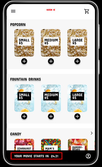
Noshie is an app for ordering snacks at the movie theater. It is designed to sync with the movie tickets a customer has purchased so that they are able to buy their snacks ahead of time and pick them up on the way in to see a film.
Project duration: April 2022 - Feb. 2023
Role: UX Designer & UX Researcher creating the Noshie App from concept to delivery.
The Problem: Ordering snacks at the movie theater can take a long time and is inconvenient.
The Goal: Design an app that allows users to easily order and pick up snacks at the movie theater.
User Research
I created surveys and conducted interviews along with creating empathy maps to understand the users I’m designing for and their needs. One primary user group identified through this research was adults who dislike waiting in line for snacks before seeing the movie.
This user group confirmed initial assumptions about the desire for convenience, however research shows additional user problems such as high snack prices and not knowing where or how to pick up their snacks after they’ve ordered them.
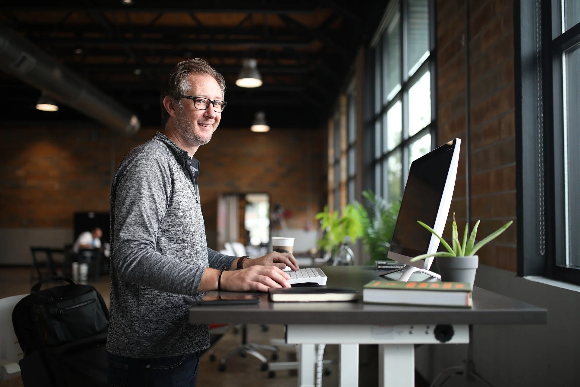
User Persona: Marc
Age: 55 Education: Master’s Degree Hometown: Seattle, WA Family: Married, 3 kids Occupation: IT Consulting
Marc and his husband like to take their kids to the movies often. The whole family likes to share snacks, but they often find that their food is cold or the lines are very long. Sometimes Marc has to work late, so he meets his family at the theater. He finds it stressful to wait in line because he doesn’t want to miss the beginning of the film.
Problem Statement: Marc is a busy father of 3 who needs to pre-order snacks at the movie theater because he has a large order to place and doesn’t want to miss the previews.
Goals
The ability to order snacks ahead of time.
Warm and fresh snacks.
Frustrations
Ordering lines are too long.
Service is inconsistent.
“The previews are the best part, but not without my Diet Coke!”
User Pain Points
Time
Snack lines are long; users are worried about missing their movie.
Delivery
Users don’t know where to pick up their snacks.
Accessibility
Existing platforms for ordering snacks are not user friendly. They are confusing, inaccurate, and cluttered.
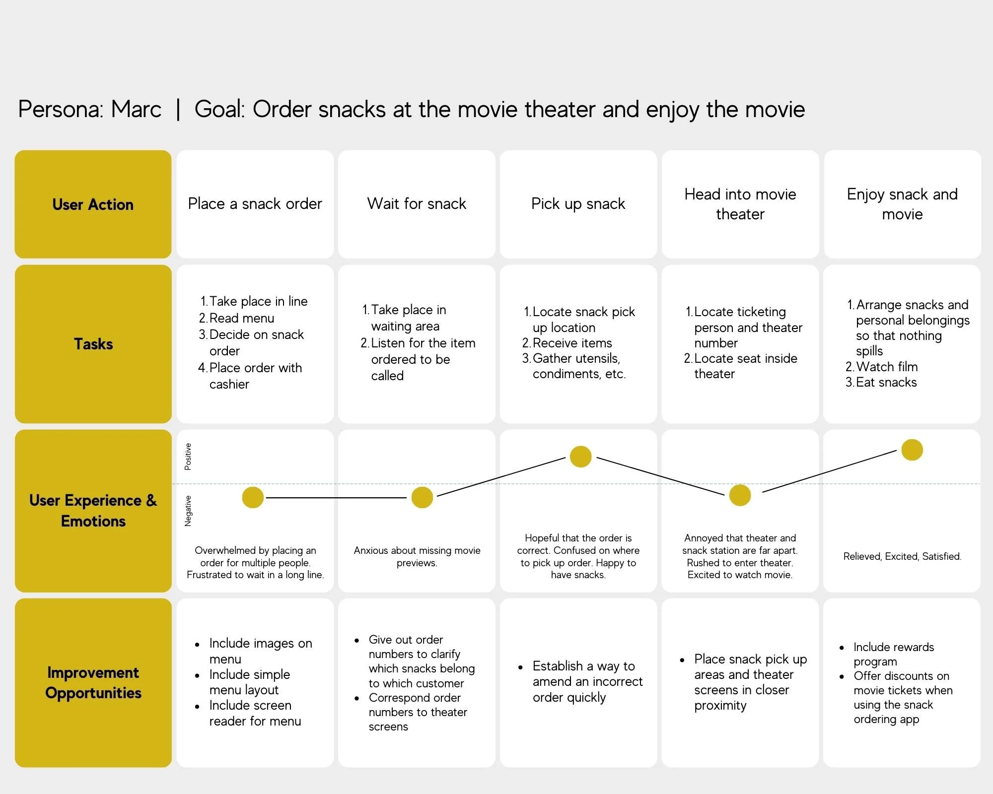
User Journey Map
Mapping Marc’s user journey confirmed how helpful the Noshie App will be to moviegoers.
The Design Process
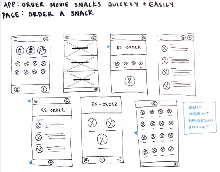
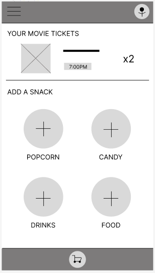
In drafting iterations of each screen on paper, I was able to map the necessary elements needed in the digital wireframes. Both paper and digital wireframes had rounds of edits and revisions in order to get the design just right.
I focused on a simple and straightforward ordering process.
Once I moved to digital wireframing, I made sure to base designs off of user feedback and findings from user research.
Breaking down the design into clearly designated categories simplifies the user journey.
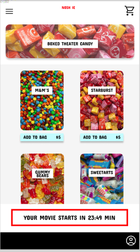
A screen for each category makes it easy to know exactly what you’re ordering.
Images with each item allows for accessibility.
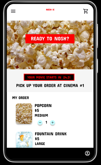
This section gives information about the order.
These large buttons make it easy to find the type of snack that you’re looking for.
Lo-Fi Prototype
The primary user flow of this low-fidelity prototype is selecting a snack and completing an order. I used this design flow in a usability study in order to test the prototype and gather feedback.
Usability Study Findings
I conducted two rounds of usability studies. The first study helped guide the designs from wireframes to mockups. The second study used a high-fidelity prototype and revealed what aspects of the mockups needed refining.
Round 1 Findings
Users want a way to return to the previous item/screen
Users want images
Users want to see prices before adding to their cart
Round 2 Findings
Users want the ability to easily edit their cart
Users want pick up information at checkout
Users don’t want as many options
Early Designs & Iterations
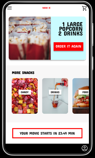
Early designs allowed for easy navigation, but after usability studies I added options for a personalized experience and revised designs to include user requests. Further usability studies revealed complications in the user journey. I significantly revised the design for a simpler experience.
Home page before Usability Study #1
Home page after Usability Study #1
Home page after Usability Study #2
In revising the design after the second Usability Study, I modified the ordering pages. Users are able to see the different categories of snack on one screen rather than having to navigate through multiple screens, allowing for a seamless experience.
Before Usability Study #2
After Usability Study #2
Key Mockups
Hi-Fi Prototype
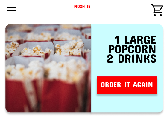
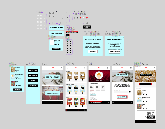
The final high-fidelity prototype presented a clear user flow for ordering snacks along with a page to create a personalized profile to save user information.
Accessibility Considerations
Tested the design color palette to ensure contrast accessibility for visually impaired users.
Used icons for simple navigation.
Used detailed images and clearly worded labels to help all users better understand designs.
In Conclusion
The Noshie Mobile App is simple and clear which makes using it and going to the movies a more enjoyable experience.
I learned that continuous iteration on designs with help from user feedback was necessary and made designs stronger every time.
“This app is very straightforward and user friendly. I think I would use this every time I go to the movies.” - user feedback
Going Forward
Conduct another round of usability studies to identify if pain points were adequately addressed.
Conduct additional user research to determine any new areas of need.
Implement new findings into design.
Thank you for viewing the Noshie Mobile App Case Study!
If you are a developer interested in bringing this design to fruition, please get in touch. More of my designs can be viewed on the ‘Recent Projects’ page.

