Hellbender Vinyl Website
Project Overview
Hellbender Vinyl is a small business that presses vinyl records for musicians of all genres. To compete with other like-minded businesses, Hellbender was seeking an easy to use website that accurately reflected their brand.
Project duration: April 2023 - June 2023
Role: UX Designer
The Problem: Musicians need a fast and easy way to order vinyl records for their bands.
The Goal: Design a website that is easy to place an order, aligns with Hellbender’s branding, and converts easily from desktop to mobile.
User Research
Hellbender has been in business for some time but wanted to create a website that felt authentic to their brand and easy to use. As the primary UX designer I was given a color palette and logo files, and some cursory user research. I then created a survey to send to current and potential Hellbender clients to understand their needs.
The survey group revealed that users like the ability to choose from many custom options, and that price transparency is a top priority.
User Survey Questions
1. If you have ordered vinyl before please state something that you liked and something that you didn't like about the process.
2. If you have not ordered vinyl before please state if/why you chose to order CDs, tapes, publish streaming, etc. instead.
3. When ordering vinyl, how do you prefer to choose color/transparency options?
4. How comfortable are you creating your album's artwork to the correct size and resolution for your vinyl order?
Most Users
Want the ability to see all customizable ordering options.
Prefer to see pricing during the ordering process.
State that cost and turnaround time are the largest barriers to purchasing vinyl records.
Survey Findings
Some Users
Want updates about their order through the entire process.
Want a chat feature, phone number, or other customer support option.
State that assistance in creating and uploading album artwork would be helpful.
The Design Process
I began working with the original Hellbender website design per the owner’s request.
In drafting iterations of the home screen, I was able to map the necessary elements to carry forward in the final design.
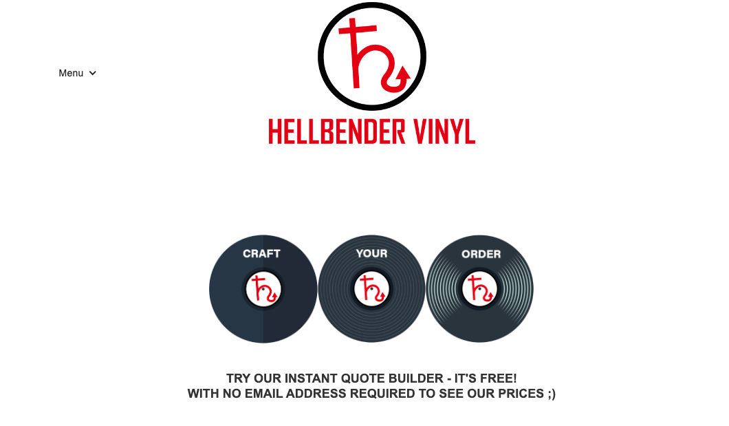
The first iteration of the home page focused on showcasing the company as a whole.
User and client feedback directed further edits to hone in on the user journey.
Musicians start here to begin their custom order journey.
This section showcases Hellbender’s current musicians.
Further designs split the ‘about us’, ‘contact’, and ‘portfolio’ sections into their own separate pages.
Hi-Fi Prototype
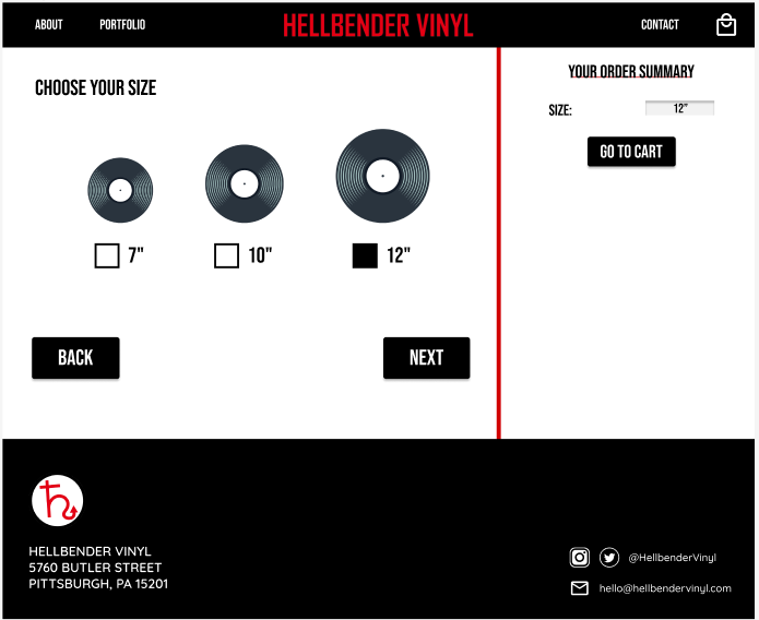
The primary user flow of this hi-fi prototype is selecting customizable options and completing an order.
As the user moves through the process, an order summary detailing their choices auto-fills on the right hand side of the screen.
Converting to Mobile
Creating a design that translated well to mobile devices was a top priority.
The mobile prototype contains the same color palette, branding, and user flow in order to remain consistent across devices.
User Feedback
The Hellbender Website design is simple, clear, and one of the most user-friendly vinyl ordering websites on the market.
Users are excited to order from Hellbender and feel that they are able to choose an order that is customized to their liking. Users also state that they are hoping for even more customizable options in the future.
“I think it's really exciting to have total control over your order and ALL options displayed for you to decide from.” - user feedback
Going Forward
Conduct another round of usability studies to identify if pain points were adequately addressed.
Design and develop a user portal where customers can view their past orders, save payment information, track order statuses, and place re-orders.
Design and develop an artwork uploader that allows users to see what their designs will look like before completing an order.
Thank you for viewing the Hellbender Vinyl Website Case Study!
This design is currently under construction with Hellbender Vinyl. More of my designs can be viewed on the ‘Recent Projects’ page.


